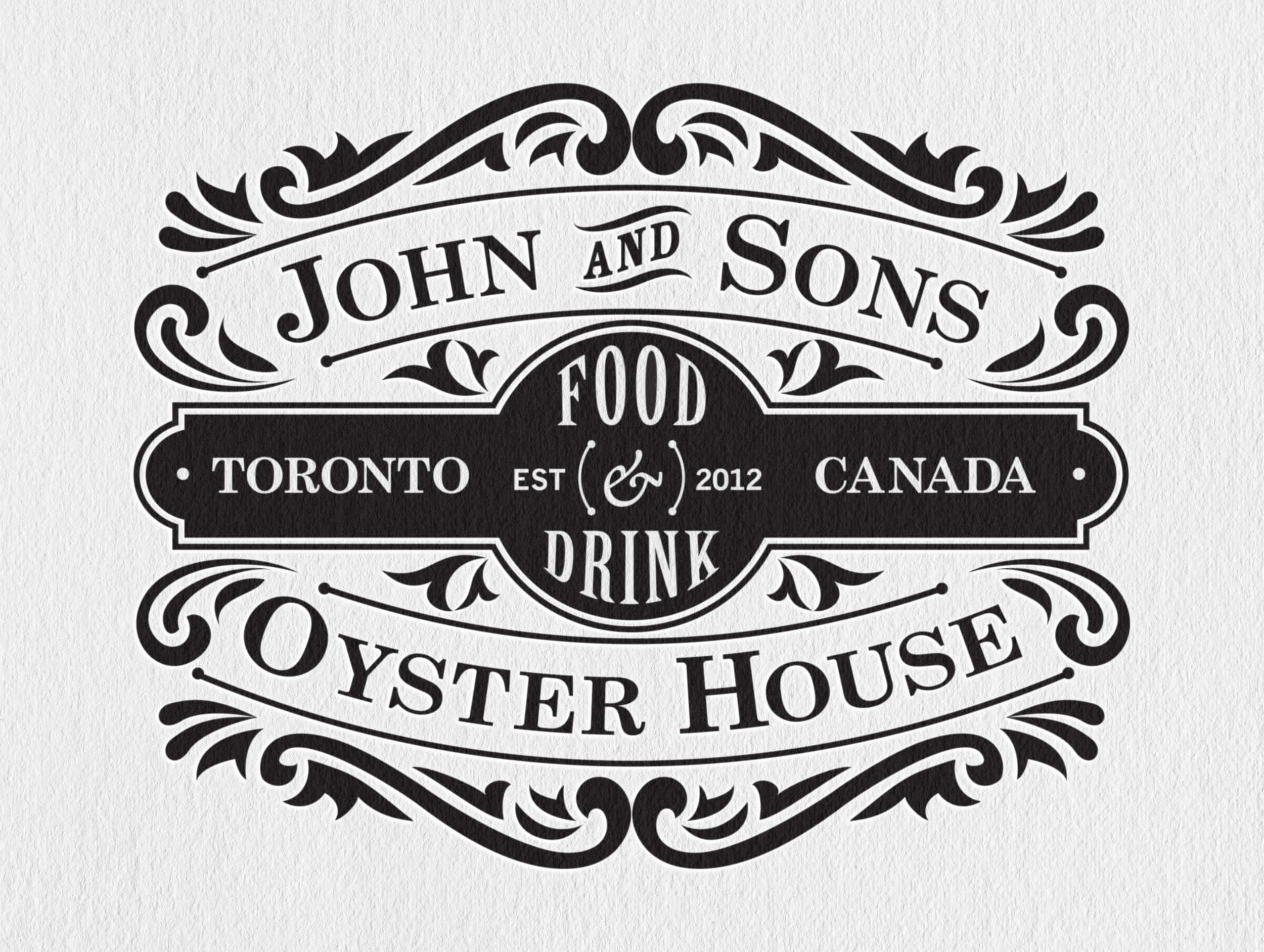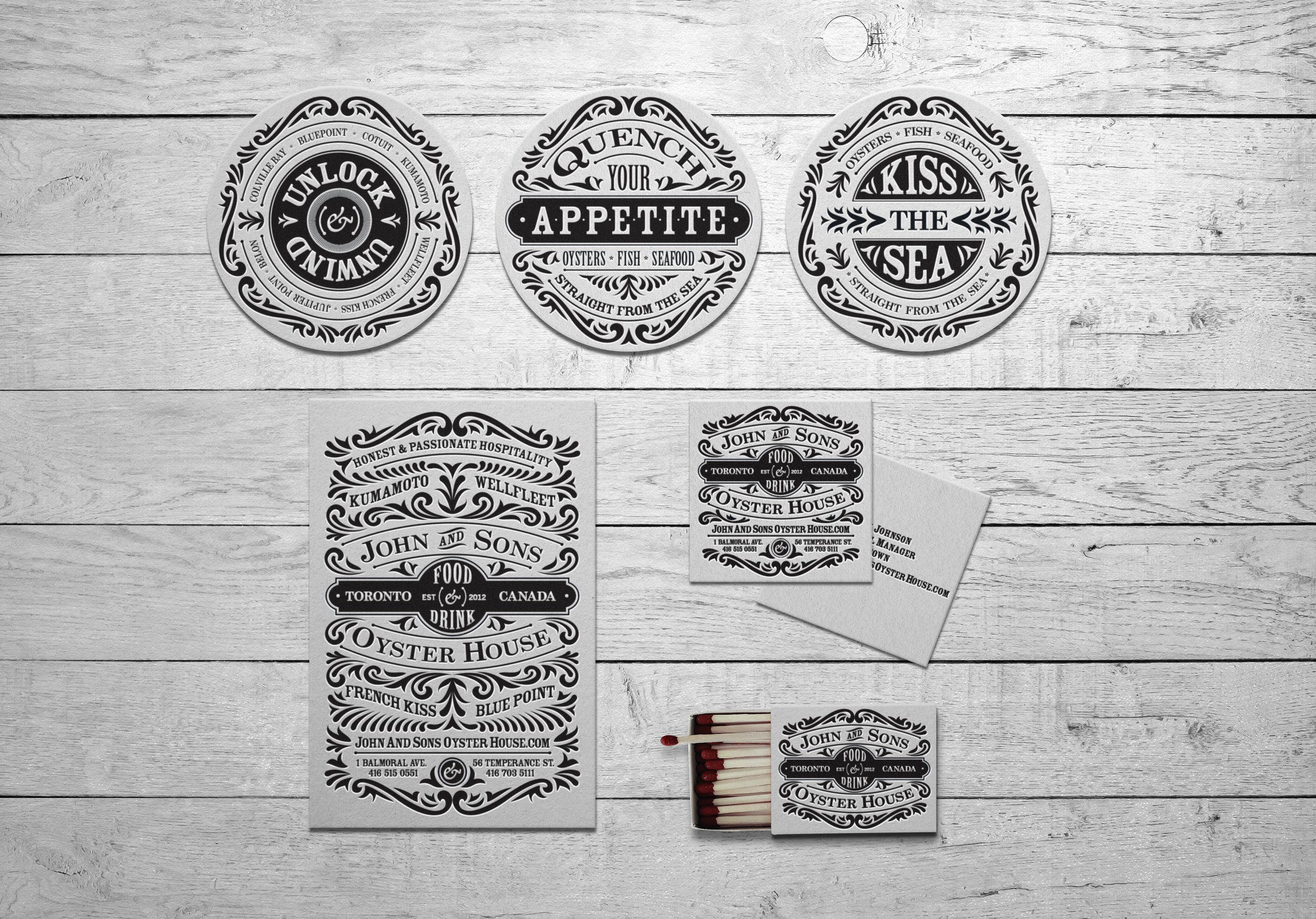


John & Sons Oyster House
Collateral
Copywriting
Illustration
When I was approached by John and Sons for a logo refresh and printed materials, I utilized the original logo as a starting point and developed a design style with an emphasis on hand-drawn flourish ornaments. These intricate embellishments are eye-catching, creating a striking contrast and seamlessly fitting together like puzzle pieces. The end result needed to be a harmonious composition that achieved a perfect balance between typography, ornaments, and white space.